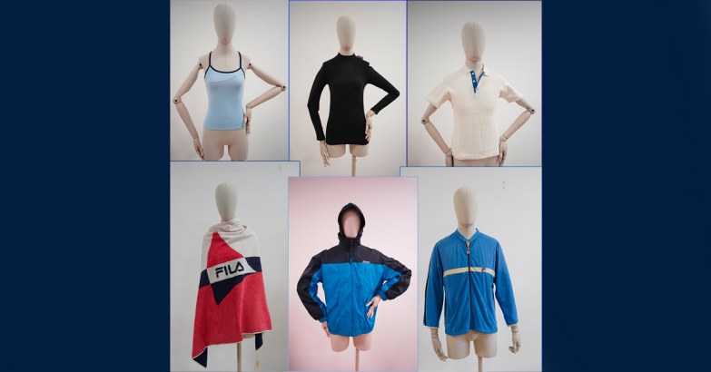
COLOUR PALETTE: BLUE
Andrea Sachs (Anne Hathaway), the leading character of the film The Devil Wears Prada (2005), hadn’t realised the power of Miranda Priestley when, during a styling session, she laughs out loud at the seriousness over a choice of belts.
The editor of the fictitious fashion magazine Runway, interpreted by Meryl Streep, shuts her up with a monologue that made history: ‘You think this has nothing to do with you. You go to your closet, and you select… I don’t know, that lumpy blue sweater, for instance, because you’re trying to tell the world that you take yourself too seriously to care about what you put on your back, but what you don’t know is that that sweater is not just blue, it’s not turquoise, it’s not lapis, it’s actually cerulean. […] It’s sort of comical how you think that you’ve made a choice that exempts you from the fashion industry when, in fact, you’re wearing a sweater that was selected for you by the people in this room… from a pile of “stuff”’.
In 2016 Caitlin Dewey reported in the Washington Post a study that blue would be the most widespread colour on the internet, as well as the most popular in the world across all demographics. When we consider that ancient cave paintings were dominated by red tones, this is an interesting fact.
The first civilization to show an appreciation for blue was Ancient Egypt, where lapis lazuli stones from Badakhshan were placed on funerary masks, such as that of the pharaoh Tutankhamon. However, their price prohibited this practice among Ancient Greeks and Romans, and as a result, the incredibly rich Ancient Greek language does not have a word to describe ‘blue’. In fact, it only became widespread in the early Middle Ages, after the Council of Ephesus (AD 431) stated that the Virgin’s veil had to be rendered in light blue tones. From then on, the colour was associated with the religious and spiritual worlds.
During the Renaissance, blue was associated with aristocracy, and portraits of ladies were replete with draped fabrics in all variations of blue. Another key role for blue came about through the evolution of science. In 1706, the Swiss pigment and dye producer Johann Jacob Diesbach mixed Prussian blue, a vibrant shade that was soon adopted in painting: for example in the masterwork The Great Wave off Kanagawa, by Japanese painter Hokusai (1831). The colour became so popular that it soon morphed into different shades – from cobalt to ultramarine and cerulean blue.
A more recent major variation, International Klein Blue (IKB), was registered in 1960 by French artist Yves Klein, who used it predominantly in his work because ‘it has no dimension, it goes beyond dimensions’. The same colour was featured in one of the most radical films in the history of cinema, Derek Jarman’s Blue (1993) – 75 minutes of blue frames accompanied only by a narrator and subtitles.
Among Yves Klein Blue’s fans is the Colombian designer Haider Ackermann, who conceived FILA’s 2023 Fall Winter collection by putting the colour through an acidic prism. We all know that in the sportswear brand’s heritage blue is present with different moods and shades: navy in the F-BOX logo and in the earliest tennis tracksuits, light blue in AQUA TIME swimsuits and electric blue in iconic pieces such as the ‘Jet Suit’ skiing suit worn at the 2006 Winter Olympics in Turin.
Back to the articles!

